
Fifty Shades of Beige: How the World’s Most Discreet Hue Killed Color
Every year, the color institute Pantone names a Color of the Year. This year, they call it Cloud Dancer 11-4201. Others would probably just call it beige. Look at the headline of this article – you can see it there. It’s the color in the background.
Over the past several years, that muted tone has quietly made its way into our homes, our cityscapes, and our feeds. But how did this understated shade suddenly become the color that captures the mood of the moment?
By Anna Skovby Hansen
»A Whisper of Tranquility and Peace in a Noisy World.«
That is how Pantone introduces this year’s color. A shade that, according to the color institute, captures the mood of the moment – and in doing so points to the tones that will shape everything from fashion to design to home decor.
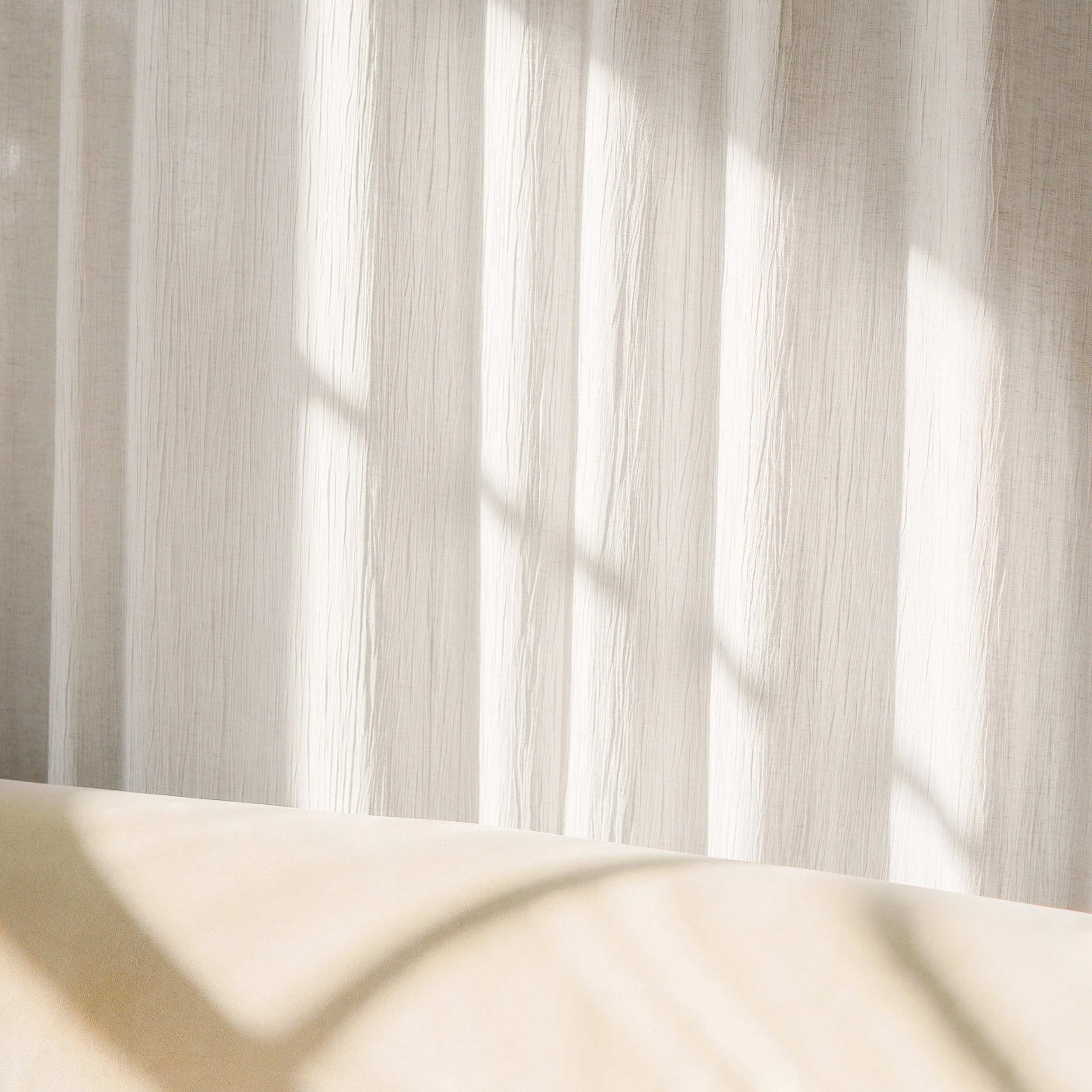
Off-white. Cream. Ecru. Beige.
The list of beige tones is nearly endless, and so are the images circulating on social media of beige interiors. Beige couches, beige kitchens, beige walls, and beige influencers with beige-clad children. An endless feed of muted tones that almost blur together.
How did we become so captivated by beige? Is it simply Danish hygge distilled into a single shade? Or is it more like a form of domestic crisis management – an attempt to create calm in a world that never stops clamoring for our attention?
For years now, beige has been slowly taking over our living rooms – and maybe our lives, too.
"No one is remembered for choosing beige."
A Beige Invasion of Danish Homes
Far removed from beige and broken white, Sarah Gottlieb sits in her light green living room. She is a color expert with a master’s degree in visual communication, and today she works on developing color concepts for spaces, furniture, and design products. Her own entryway is bubblegum pink.
»Beige may be more of a symptom than an enemy. Even though I’m not a huge fan of beige, it’s not really my opponent either. But I see it as an expression of our fear of making decisions,« she says.
The beige invasion happened almost silently. Maybe precisely because the color does not shout the way Art Deco pastels or earlier decades’ color waves did. Beige has become the safe choice. A color that works in real estate listings because it rarely turns anyone away – unlike the bold-tiled bathrooms of the 1970s and 1980s, which can make first-time buyers hesitate.
Beige is as safe as silver-gray cars, blue jeans, and a cloudless sky when you’re not on vacation.
But there are also signs that beige may be reaching its point of mainstream saturation, says Mads Arlien-Søborg, a lifestyle expert and trend forecaster. He has worked with color trends in home decor, design, and fashion for more than 20 years.
»Beige is in its mainstream phase now. If you’re an early adopter, you’re already moving on – maybe you’ve even started making a little fun of it. Some influencers call it ‘sad beige,’ and all the nicknames are a sign that some people are starting to let it go. Right now, we’re in a phase of trying things out before the next color lands,« says Mads Arlien-Søborg.
For now, there is little to suggest that consumers have let go of beige.
That is something companies like Flügger are seeing as well. The company sells paint and colors all over the world – and a great deal of it in muted tones.
»In 2025, we launched a color card, Flügger 32, made up exclusively of off-whites, light grays, and a wide range of beige shades. We are seeing strong demand for colors that sit between gray and beige – what we commonly call greige. They’re warmer than gray, but cooler than a classic beige,« says Fie Hetting, Head of Design at Flügger.
Sad Beige in Your Feed
So beige is a hit in our homes and in interior magazines. And it fills our phones too – paradoxically, on screens capable of displaying more than 16 million different colors.
You do not have to scroll long on Instagram before the shades start taking over your entire feed. A beige-ification. Beige curtains, beige kitchen cabinet doors, beige dining chairs. It can almost seem as if even the algorithm shaping your feed has developed a special fondness for the color.
Almost like a law of nature, the phenomenon has also become the subject of satire on social media. Under labels like ”sad beige,” ”sad beige mom,” and ”sad beige parenting,” memes circulate about homes and children’s rooms decorated exclusively in muted natural tones. The criticism is that the monotonous colors make both the home and childhood itself feel sad.
For color expert Sarah Gottlieb, beige primarily represents a form of aesthetic safety. She stresses that the color itself is not the problem, but the extent of its use.
»Beige is a fantastic background and a lovely neutral palette. But if it stands alone, it becomes bland, boring, and uninspiring,« says Sarah Gottlieb.

Color Is About Identity and Memory
As you move farther through Sarah Gottlieb’s home, the atmosphere shifts with each room. The bedroom is painted in a deep dark blue shade that almost mirrors a cloudless night sky. To Sarah Gottlieb, it is a safe and enveloping color that works well in a room meant for sleep.
»When I work with color, a lot of it is about memory and identity. We register color before we see anything else, and that’s why we also react more instinctively to a room that has color in it,« she says.
Maybe we are simply living in a time when crises and conflicts take up more space than ever. After a day of news streams about war, inflation, and sky-high housing prices – and constant exposure to stimuli – beige can seem like the calm so many people long for.
When the key turns in the front door, home becomes a sanctuary. A place without noise and expectations. A quiet reassurance that here, things are safe and good.
But that very sense of safety can also have an aesthetically impoverished downside, Sarah Gottlieb argues.
»When everything becomes beige, it also becomes an absence of taking a stand. A fear of making a statement and of making a choice. No one is remembered for choosing beige. If we don’t dare stand out a little in our choices, then nothing will be remembered for the future either,« she says.
Beige Is a Crisis Color
Beige did not appear out of nowhere. As an extension of the nature-oriented lifestyle of the 2010s – when yoga, mindfulness, and self-help books moved into everyday life, and when the home increasingly needed to feel grounded and balanced – the color gained momentum, explains trend forecaster Mads Arlien-Søborg.
»Something happens during the 2010s, when we begin drawing inspiration from nature. Everything gets warmer in tone, and beige is, in essence, a natural color – an attempt to reconnect with something more fundamental,« he says.
But according to Mads Arlien-Søborg, the color does not have its real breakthrough until the start of the 2020s and COVID-19, when the world suddenly became more unpredictable.
»Beige functions as a classic crisis color. When the outside world feels chaotic, it creates a sense of security that neither white nor gray can – they’re too cold. Beige becomes a way of stepping into the home and shutting the unrest out.«
"Future design and color schemes will increasingly take their cue from local identity."
Beige and Nordic Minimalism
The Nordic region is especially known for its minimalism: clean lines, functional simplicity, and an uncompromising belief in removing everything unnecessary. Beige can be seen as an extension of that tradition.
At the same time, the color fits almost perfectly into the wave shaping many Nordic brands right now, with tendencies such as soft or warm minimalism.
»Here, materials, spaces, and products are toned down into warm natural colors and tactile surfaces – an aesthetic cultivated by brands such as FRAMA and AUDO Copenhagen, among others. Beige works incredibly well in the Nordic context. Many brands have fully embraced natural tones and made them part of their identity,« explains Mads Arlien-Søborg.
Historically, however, Nordic minimalism was never about neutrality, but about functionality. For architects such as Arne Jacobsen and Poul Kjærholm, simplicity was the result of precision, with materials, proportions, and function stripped down to the essentials.
According to Sarah Gottlieb, beige in some cases risks doing the opposite.
»Nordic minimalism is about functionalist clarity. Beige can become a kind of visual neutralization – a shortcut where you think you’re working minimally, but you’re really just muting everything. There is so much beauty in Nordic minimalism, but you have to dig deeper into the color palette to find tones that actually support that simplicity,« she emphasizes.
Social Media as the Arbiter of Taste
It is hardly a secret anymore that social media plays a decisive role in how trends emerge and spread. Today, inspiration comes from the same feeds, the same algorithms, and often the same images.
In 2020, American cultural critic Kyle Chayka struck a nerve with the essay AirSpace, in which he described how urban spaces around the world were slowly starting to look alike because we all orient ourselves around the same digital references.
Maybe you know the feeling yourself. Whether you are in Berlin, New York, Tokyo, Barcelona, Stockholm, or Copenhagen, a certain familiarity appears. The cafes, restaurants, and hotels start to resemble each other.
You can probably already picture the modern coffee bar: minimalist, curated spaces. Muted gray and beige tones, warm wood surfaces, and ceramic cups in organic shapes. Even the coffee is light-roasted and nearly hits a beige tone when it is handed across the counter.
According to Mads Arlien-Søborg, the uniformity is no accident. It has become part of the identity.
»Designers go for the aesthetic that works as a signal to the right audience. A bit like Starbucks used to – you choose the places because you know what you’re getting and who you’ll meet there,« he says.
But the safety of familiarity comes at a price. When aesthetics become standardized, the distinct character of cities slowly starts to fade.
»The risk is that cities lose some of their authenticity. The next step is that we once again have to ask: What makes this particular place unique? Future design and color schemes will increasingly take their cue from local identity,« says Mads Arlien-Søborg.
A Bold Return of Color as a Counterreaction
At the same time, a countermovement is beginning to emerge in both algorithms and interiors. Under the label dopamine decor, rooms are once again filling up with color: red doorframes, light blue curtains, lemon-yellow walls, and checkered rugs. An almost euphoric jumble of colors and patterns thrown together every which way.
From a physiological perspective, color has a function that goes far beyond aesthetics.
»Color gives us signals. Going all the way back to early humans, it was about something as concrete as: Can I eat this, or can’t I? In the same way, color gives direction, rhythm, and energy to a room,« says Sarah Gottlieb.
Reddish and terracotta tones are often used in restaurants because they stimulate appetite by increasing heart rate and kicks metabolism into gear – an effect Sarah Gottlieb herself works with quite a bit.
She personally often returns to the green palette.
»Green feels endless. It is also the color humans can distinguish the most shades of, and that’s why it contains an enormous range of moods you can move through,« she says.
The End of Beige?
As we all know, everything comes to an end. The question is whether that also applies to beige.
»Beige probably still has a few years left, but it has started to fade. People are already talking about the end of beige, but the challenge is that there is not yet one clear color ready to take over,« Mads Arlien-Søborg says.
And that is exactly what makes the transition interesting. Instead of one new dominant shade, we may be in an in-between phase where different directions are being tested at the same time.
According to Mads Arlien-Søborg, we should expect more color to return to our homes in general over the coming years – both dusty pastels and more pronounced shades.
»But I don’t think beige will be replaced anytime soon. I don’t see a clear color taking over in either 2026 or 2027,« he concludes.
What Pantone will choose as next year’s Color of the Year is hard to know. But all signs suggest we have not heard the last of beige.
Mere fra DAC Magazine

The Art of Eating: Where Food Meets Architecture

Verner Panton Rebelled Against Sharp Lines and the Color White

Brushstroke by brushstroke, the painter brings the city to life – painting it red. And green. And blue. And quite a bit of white

Barbara Marstrand on Life Behind the Door of the Teenage Bedroom