Color Theory: How to Use Color, Contrast, and Understand Color Symbolism
Colors and color theory play a crucial role in how we understand images, color contrast, and color symbolism in drawing and collage.
By Dansk Arkitektur Center

When you draw, it is helpful to understand color theory. How do different colors work together, and do colors have symbolic meaning? One of the advantages of collage is that you can move elements around and see what works best before fixing them in place.
Color Mixing
In color theory, it is essential to understand how to mix colors and how different shades are created. If you don’t have the exact color you need, you can mix it yourself. In principle, you only need red, blue, yellow, black, and white to create all color variations.
Primary and Secondary Colors
The three colors red, yellow, and blue are called primary colors. They cannot be created by mixing other colors, but almost all other colors can be mixed from them.
When you mix primary colors, you get:
Red + blue = purple
Red + yellow = orange
Blue + yellow = green
By adjusting the proportions, you can create many different shades.
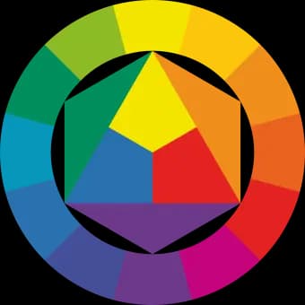
The color wheel is a key tool in color theory. It shows how colors are created by mixing primary colors.
If you want a specific shade—such as a yellow tone—you can use the color wheel to determine whether it should lean toward green or orange. Adding blue shifts it toward green; adding red shifts it toward orange.
Mixing all colors results in a grayish-brown tone.
Brown is created by mixing all three primary colors, with red as the dominant color.
Complementary Colors
In color theory, complementary colors are colors positioned opposite each other on the color wheel.
Adding a color’s complementary color will mute it, making it more neutral or grayish. Examples include:
Yellow and purple
Red and green
Blue and orange
Black and White
Black and white are not technically colors. When mixed with colors, they change the color’s value (lightness or darkness).
Colors mixed with black or white appear less pure.
If you want a lighter red, you should mix in yellow—not white. Adding white creates pink.
Properties of Color
Each color has three key properties that determine how it appears:
- Hue. The name of the color—red, yellow, blue, green, etc.
- Value. How light or dark the color is. This is independent of the color itself.
- Saturation (intensity). How vivid or muted the color is. A pure color is strong and intense, while a color becomes more muted when mixed with other colors, black, white, or complementary colors.
When painting, you should consider whether to use light or dark colors, and whether to work with pure or muted tones. A bright color placed among muted colors will stand out strongly.
Color Symbolism
In color theory, color symbolism plays an important role in how we interpret images. However, there are no fixed meanings for colors.
A color can have different—even opposite—meanings depending on context. For example, red can symbolize both love and anger. Therefore, it is always important to consider how a color is used.
General associations include:
Red: love, anger, warmth, fire, life
Blue: cold, calm, loyalty, the sky
Yellow: warmth, jealousy
Green: hope, spring, life
Brown: earth, calm, death
White: purity, innocence, death, peace
Black: death, darkness, evil
Color Contrast
Color contrast plays a key role in creating visual interest and depth in an image.
Light/Dark Contrast
Is the image light or dark? Are the lightest and darkest colors placed next to each other?
Strong contrasts between light and dark make bright colors stand out.
Black and white represent the strongest contrast, with many shades of gray in between.
Within the color wheel, the strongest contrast is between yellow and violet.
Warm/Cool Contrast
Is the image warm or cool? Are warm and cool colors placed next to each other?
The strongest warm/cool contrast is between blue-green and red-orange.
Whether a color feels warm or cool often depends on the surrounding colors.
A color is not necessarily cool because it is dark, and a light red can still feel cool, just as a dark blue can feel warm.
Complementary Contrast
Every color has an opposite—its complementary color.
The contrast between complementary colors is the strongest possible. This is because they share no common elements. Pairing complementary colors creates strong visual impact and can produce either tension or balance, depending on how they are used.